|
|
The evolution of the CPL logo
Did you know that it took us 3 weeks time on creating the logo for our Complex Plasma Laboratory? Did you know that there were 6 prototypes before the final logo was coined?
|
|
When we decided to build our website, it was apparent to us that we need to develop a logo that will lead the design and the overall look of the webpages. There were few basic criteria for the design of the logo.
1- The logo should convey the idea of complex
plasma, that is, the idea of dust particles and ionised gas.
2- The logo must not use more than 3 colors if possible.
3- The logo must be simple yet the details should be visible even in small
size.
Having that in mind, we came up with the very first design as shown in fig. 2. As you can see, the design is consisted of 5 purple 3-D ovals of different lengths. The color purple was chosen because it reminds people of the color that they commonly see in a plasma discharge. And the 5 ovals is an abstract depiction of the muti-layered structure of the the crystals. And originally we were going to name ourselves the Advanced Plasma Laboratory. So the three english letters A, P, and L was placed at the base of the logo.
However, this logo was not chosen because it does not give the impression that it relates to dust particles
|
|
Figure 2 - The first prototypes from our logo designing process. It consists of 5 purple ovals.
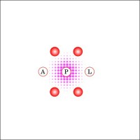
The second logo that we came up with is consisted of 7 red circles (6 around 1) on a diffused pink background. The red circles represent the laser illuminated particles that you see in a typical dust crystal experiment. And the diffused pink background represents the Argon plasma. Later on we added light bolts to it to emphasize that the logo is related to plasma. However, due to its complexity, we discarded this design.
 |
 |
|
|
|
Figure 3 - The second prototype from our logo designing process. It consists of 7 red particles on a diffused pink background
At the end, we came up with a new design that combines the simplicity of the first prototype and the structural design of the second prototype. The third prototype is consisted of three purple english letter A, P and L arranged in a hexagonal pattern. A particle is place at one of the corners of the hexagon. This design satisfy both the idea of color minimalism and the hexagonal pattern commonly observed in a crystal layer.
|
|
Figure 4 - The third prototype from our logo designing process. This stage is getting towards the final design of our lab logo.

Figure 5- The final logo which is used as our lab logo. This stage is getting towards the final design of our lab logo.
So as you can see, alot of hardwork and imagination was put into the construction of our website. I hope everyone find this story interesting.